Tuesday, May 25, 2010

Lab 8: 2000 Census in ArcGIS

BLACKS BY COUNTY IN THE CONTINENTAL U.S.
This choropleth map shows the concentration of Blacks in the continental United States, particularly their percentage of the county population according to the 2000 Census. As we can see, counties with high percentages of blacks in their population are mostly located in the Southern U.S., most notably the states of Georgia, Alabama, Mississippi, and Louisiana. Several counties in those states have the black population making up 47 to 87 percent of the total population. One only needs to understand the unfortunate institution of slavery in American history to understand this trend. In the West Coast, East Coast, and Midwest, the black population seems to average around 4 to 20 percent of those respective county populations. However, in the Northwest the black population only makes up 0 to 4 percent of the county populations for the most part.

ASIANS BY COUNTY IN THE CONTINENTAL U.S.

This choropleth map shows the concentration of Asians in the continental United States, particularly their percentage of the county population according to the 2000 Census. The asian population is much more spread out than the black population. Concentrations of adjacent counties with high Asian percentages of county population, specifically 7 to 47 percent, are located throughout the West Coast, most notably in California. Note that throughout the continental U.S. there are consistently one or two counties that also have this high density of population. Beginning in their roots in the West Coast until today, Asians seems to have successfully established strong communities throughout the U.S.

"SOME OTHER RACE" BY COUNTY IN THE CONTINENTAL U.S.
This choropleth map shows the concentration of "some other race", in this case Hispanics, in the continental United States. As in the previous two, it shows their percentage of the county population according to the 2000 Census. Not unlike the Asian population, Hispanics make up large percentages of county populations in the West Coast in California, specifically 20 to 40 percent. The Hispanics also make up similar large percentages of the Southwest county populations in Arizona, New Mexico, and Texas. The proximity of this region to Mexico, and the rest of Central and South America clearly explain this phenomenon. It is clear to see that Hispanics have also successfully created strong communities throughout the continental U.S.

Working on this census map series made me aware of how complex population analysis can be. It is definitely not as simple as just quantifying each ethnicity as a percentage of the whole United States, because then we would be missing out on most of the valuable spatial data. Only when the data is broken down by county, can we truly see the trends in population growth of each respective ethnicity. Then it becomes easy to use the data to assess certain issues and to make the necessary changes to address them. Governments can decide where to establish organizations to benefit specific groups of people, and businesses can decide what kind of products to sell and how to advertise in specific areas. This lab, along with the previous labs in this class, have proven to me the invaluable role that GIS has in our world today.

Looking at the big picture, powerful spatial analysis is necessary to understand complex social, political, and economic trends, which then enables the necessary policy changes and infrastructure upgrades. My experience with GIS was very straightforward and informative, and I am certain that I will be taking advantage of it in one way or another once I start working as an engineer.
Sunday, May 23, 2010

Lab 7: Mapping the Station Fire in ArcGIS

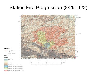
FIRE PROGRESSION

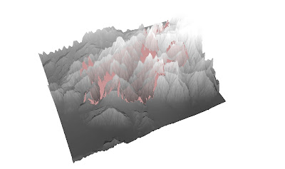
3D MODEL

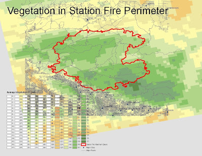
AVERAGE VEGETATION

The Station Fire ravaged Northern Los Angeles in the Fall of 2009. Residents of this part of California have grown accustomed to the dry, hot, fiery season that accompanies the Santa Ana winds, which in several cases has created minor brushfires that somewhat threatened their homes. However, the Station Fire was one of several behemoth blazes that came earlier than usual. It began earlier than the normal fire season, in August rather than September, before the Santa Ana winds came. Despite the lack of winds, the fires burned well into the month of October. It burned in the hilly, vegetated area northeast of the San Fernando Valley, north of the San Gabriel Valley, and south of the Antelope Valley, in Northern Los Angeles, and required the Governor to declare a state of emergency. It torched an area of 251 square miles and unfortunately took the lives of two firefighters. (cdfdata.fire.ca.gov, 2009).

At the beginning of the fire on August 31, there was just 1 injury, about 12,000 people threatened, 500 structures threatened, 53 structures destroyed, and 2 communication sites destroyed. By September 27, these numbers ballooned to 89 residences destroyed, 13 residences damaged, 26 commercial properties destroyed, 22 commercial properties damaged, 94 outbuildings destroyed, and 22 outbuildings damaged. In the midst of the battle against this blaze were 647 personnel, 5 helicopters, 27 fire engines, 14 hand crews, and 23 pieces of heavy equipment. (inciweb.org, 2009).

My analysis focuses on how a relatively minor brushfire can grow rapidly into a record-setting blaze. I am concerned with the spread of the fire in relation to the major population centers and major roadways in its proximity. First and foremost, my first map shows the progression of the Station Fire from August 29 to September 2, along with important information on elevation, major cities, and major roads. My second map is a 3D model of the fire, as seen from the southwest, that shows the elevation and fire perimeter on September 2 in more detail. We can see that the fire began in a relatively small area, the blue area north of La Canada-Flintridge. However, within 4 days it had spread west, north, and east to occupy a very large area that threatened several communities. In summary, the Station Fire severely threatened foothill communities including but not limited to La Crescenta, Montrose, La Canada-Flintridge, Altadena, and Acton. The GIS data used above was obtained from seamless.usgs.gov and gis.lacounty.gov.

To fully understand the rapid spread of the Station Fire we must refer to GIS data. In addition to high temperatures and high winds, the seemingly uncontrollable spread of the fire can also be attributed to difficult logistics and an abundance of fuel. First and foremost, we can refer to the first and second maps to see that the hilly elevated area magnified the effect of gravity on the downhill spread of the fire. In addition, the sparse number of roads within the area made it impossible for firefighters to quickly and effectively create a perimeter before it had grown very large. To analyze the abundance of fuel we must refer to my third map, which shows the average vegetation in the affected area. It is clear to see that the perimeter of the fire as of September 2 encompassed a densely vegetated area in the middle of several population centers. The firefighters were only able to create a perimeter in areas were the average vegetation was significantly lower, in effect where the fire had run out of fuel.

All residents in the immediate foothills south of the fire were placed under mandatory evacuation. Many homes were within realistic reach of the blaze, and the ones that weren't were also enveloped by thick, unsafe smoke and ash. Several photographs showed firefighters bravely battling flames that had come within a few feet of backyards. In neighborhoods that were not so lucky, charred trees and homes were left in the wake of the fire. There is no doubt that this fire severely affected and changed the lives of residents in the threatened communities. (latimes.com, 2009)

BIBLIOGRAPHY
"2009 California wildfires." Wikipedia. 12 May 2010. 24 May 2010.
[http://en.wikipedia.org/wiki/2009_California_wildfires]

"InciWeb: Station Fire News Release." InciWeb. 10 November 2009. 24 May 2010.
[http://www.inciweb.org/incident/1856/]

"Station Fire Incident Information." Cal Fire. 16 October 2009. 24 May 2010.
[http://cdfdata.fire.ca.gov/incidents/incidents_details_info?incident_id=377]

"LA Now: Station Fire." LA Times. 9 November 2009. 24 May 2010.
[http://latimesblogs.latimes.com/lanow/2009/11/station-fire-still-burning-in-mt-wilson-root-system-bringing-out-more-firefighters.html]

Sunday, May 16, 2010

Lab 6: DEMs in ArcGIS

My selection area is the vicinity of Big Bear Lake in San Bernardino, California. This is the closest and arguably most popular ski resort destination in Southern California. My friends and I have a lot of experience snowboarding in its numerous slopes.

SCALE 1 : 329,899
SPATIAL REFERENCE GCS_North_American_1983
DATUM D_North_American_1983
EXTENT
~top: 34.38 degrees
~left: -117.22 degrees
~right: -116.60 degrees
~bottom: 34.11 degrees

Shaded relief model of Big Bear Lake:

Slope map of Big Bear Lake:

Aspect map of Big Bear Lake:

3D image of Big Bear Lake:

Sunday, May 9, 2010

Lab 5: Projections in ArcGIS


Map projection is the process of converting a spherical model onto a planar model, while preserving certain spatial characteristics, such as distance, area, or shape. Originally conceived by projecting from within the sphere, it enables the creation of accurate flat maps. However, one must be aware that not one projection type can accurately translate all the spatial characteristics from the sphere to the plane. Thus we have different projection types, namely conformal, equidistant, and equal area, each with distinct advantages and disadvantages that are used accordingly. All these different types, regardless of their accuracies and inaccuracies, all enable the convenient representation of maps on a planar surface, allowing easy distribution and storage of maps that would not be possible with globes.

Conformal map projections, such as Mercator and Gall stereographic above, preserve shape and local angles, creating a system of orthogonal latitude and longitude gridlines. Mercator specifically represents rhumb lines derived from an initial bearing as straight lines, and stereographic preserves the shape of circles. However, conformal maps distort area, which is made obvious by the disproportionate size of Antarctica in both Mercator and Gall stereographic examples. Equidistant map projections, such as cylindrical and conic above, represent accurate distances along designated lines and outward from the center. However this type of projection significantly distorts area sizes, and does not necessarily show true distances of the points along the center, as we can see in the inaccurate distance between the Americas and Australia in the equidistant conic example. Equal area map projections, such cylindrical and sinusoidal above, preserve respective areas but fail to accurately represent latitude-longitude grid angles. Cylindrical, also known as a Gall-Peters projection, only represent true distances along the 45th parallels north and south. On the other hand, sinusoidal represents the area of the Earth as the area between two symmetrically rotated cosine curves. We can clearly see in both cylindrical and sinusoidal equal area examples that these gridlines are distorted, simply by comparing both to the conformal Mercator example.

For the purpose of our lab, in which we measured the distance between Washington, D.C. and Kabul, we clearly see the distinctions between the types of map projections. To determine bearing we can look at both Mercator and Gall Stereographic conformal map projections. We see that the linearity in all directions dictates that traveling southeast in a straight line will conveniently get me from D.C. to Kabul. To determine true distance we can look at both cylindrical and conic equidistant map projections. We see that the even mapping of longitudes and latitudes dictates that the true distance between D.C. and Kabul is around 5,065 to 6,941 miles. And as obvious as its name says, we can accurately assess the areas of the United States and Afghanistan by referring to both cylindrical and sinusoidal equal area projections. I am certain that interchanging any of these projection types with the data we are seeking, will only result in false measurements.

All map projections have both positive and negative implications depending on what information is being sought. Because it is obviously impossible to accurately translate all spatial data from a sphere to a plane, each projection will preserve some characteristics while significantly distorting the rest. As mentioned before each map projection has its proper use, which is why any spatial analysis can be rendered erroneous if the wrong type of projection is chosen. This is the reason why it is important to be aware of how each map projection was created, and what spatial data it excels in translating from the three dimensional to the two dimensional domain.

Saturday, April 24, 2010

Lab 4: Introducing ArcMap


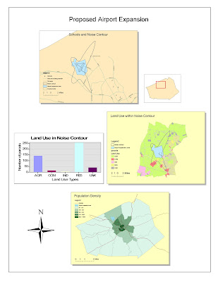
My first experience with ArcMap was made very simple and straightforward by the given tutorial. Parts one and two both took about two hours each of simply following step-by-step directions. I was able to combine existing maps with spatial data to output a GIS model of a particular airport expansion project. Many aspects of the program, such as the use of layers and the organization of files, reminded of other programs such as Photoshop and SolidWorks. Before working on this project, I had no idea that there was such powerful and fully-featured modeling software made just for GIS. I can definitely see its value in effectively creating a robust GIS model, and allowing its fast distribution and easy editing if needed.

One of the most important functions of ArcMap is to propose and to answer complicated GIS questions. For this particular lab, the general question on the feasibility of a proposed airport expansion project can be answered by applying various sets of spatial data onto a visual model that anyone can easily understand. For example, the most significant drawback of the project, the increase in the noise level in the area, is represented by a noise contour on the county map. We then overlaid additional layers containing schools in the area, land use, and population density, in order to determine if the expansion significantly affects any schools, residential zones, or large groups of the county population.

ArcMap allows the addition of all the necessary legends and scales to completely show the information. Different tables, graphs, and colors are used to clearly present data. Within the noise contour there is one school and a significant residential population. Then it would be up to local government officials to compare this GIS data with local laws and regulations to make a decision. As we can see, the strength of ArcMap comes in its ability to analyze and organize a lot of spatial data onto a map, while retaining the flexibility to edit and add data on the fly. The program is very polished, allowing the use of many of these features to show GIS information, while remaining very stable and fast. It is definitely made with professional maps and large quantities of data in mind.

However I believe that ArcMap's biggest advantage, its many features and functions, is also its biggest pitfall. The menu-based user interface can be very complicated for casual users. The sheer amount of layers that one has to keep track of can get confusing. And the saving system and file extensions are additional details that a user has to keep in mind. A casual user simply cannot pick up the program and start using it as a neogeography tool for their daily lives. This makes it necessary for a professional user to take an in-depth tutorial or class in order to take advantage of all its quirks and features, which limits the widespread use of the program to only within the GIS field and related industries.

Monday, April 19, 2010

Lab 3: Neogeography


View Basketball courts in the San Fernando Valley in a larger map

This dynamic map, made using Google Maps, provides information on the various public basketball courts in the San Fernando Valley. My buddies and I have always wished we had a tool like this to find alternative basketball facilities, because the courts that we frequent are always packed with too many people. I have divided the basketball courts into three categories: blue for indoor courts, green for outdoor courts, and red for both indoor and outdoor courts. It is interesting to note that in the approximately 260 square miles (670 square kilometers) of the San Fernando Valley, there are over 50 public basketball facilities that I know of. That's at least 1 public court for every 5 square miles. As expected about 50% of those are outdoor courts because they are the cheapest and easiest to build. Most of my friends prefer the springy hardwood indoor courts over the rough concrete outdoor courts, however it is very convenient to be knowledgeable of all our options.

Convenience is the biggest asset that neogeography brings to the table, because without a doubt it saves time and money for everyone. Consumers save time searching for places to conduct their business, and save money when details like price and quality are provided. Business owners cut down the time it would take to penetrate their local markets, and they save money on the marketing and advertising they would have needed to do so. This kind of convenience facilitates economic growth, while cutting down on the inefficiencies and delays that used to be common in the past.

However, this is not to say that neogeography is without its disadvantages. Perhaps it makes it too easy for individuals to find what they are searching for. Before the advent of online maps and portable GPS devices, learning how to read paper maps and understand verbal directions was a skill that every person absolutely had to learn. Nowadays, a person guided by such devices can drive vast distances without even the slightest idea of his or her position or direction on the road. I admit that I myself have become a fan of GPS applications on my phone, but I just cannot help but think that this kind of overdependence on them only furthers the sense of isolation and personal disconnect that technology has brought in the last few decades. What will happen when the internet and the GPS satellites fail?

Wednesday, April 7, 2010

Lab 2: USGS Topographic Maps

1. What is the name of the quadrangle?
  Beverly Hills Quadrangle

2. What are the names of the adjacent quadrangles?
  Canoga Park, Van Nuys, Burbank, Topanga, Hollywood, Venice, and   Inglewood

3. When was the quadrangle first created?
  1966

4. What datum was used to create your map?
  National Geodetic Vertical Datum of 1929

5. What is the scale of the map?
  1:24000

6. At the above scale...
  a) 5 centimeters on the map to meters on the ground?
    1200 meters
  b) 5 inches on the map to miles on the ground?
    1.89 miles
  c) One mile on the ground to inches on the map?
    2.64 inches
  d) Three kilometers on the ground to centimeters on the map?
    12.5 centimeters

7. What is the contour interval on your map?
  20 feet

8. What are the approximate geographic coordinates of...
  a) the Public Affairs Building
    34° 4' 27" and 118° 26' 18"
    34.074° and 118.438°
  b) tip of Santa Monica pier
    34° 0' 26" and 118° 29' 57"
    34.007° and 118.499°
  c) the Upper Franklin Canyon Reservoir
    34° 6' 11" and 118° 24' 46"
    34.103° and 118.413°

9. What is the approximate elevation in both feet and meters of...
  a) Greystone Mansion
    560 feet
  b) Woodlawn Cemetery
    140 feet
  c) Crestwood Hills Park
    620 feet

10. What is the UTM zone of the map?
  Zone 11

11. What are the UTM coordinates for the lower left corner of your map?
  3615000 mEasting, 3763000 mNorthing

12. How many square meters are contained within each cell of the UTM gridlines?
  1,000,000 square meters

13. Create an elevation profile along UTM northing 3771000.


14. What is the magnetic declination of the map?
  14° East

15. In which direction does water flow in the stream between the 405 and Stone Canyon Reservoir?
  From North to South

16. Crop out UCLA from the map.